retail CRM platform
IMPROVING THE “MY CLIENT LIST " FEATURE IN HUGO BOSS MOCCA APP
Hugo Boss -(Sloane square) faced challenges with the underutilised "My Client List" feature in its Mocca app. In my role as a UX designer I worked to improve this feature, to increase client engagement and enhance sales effectiveness.
Hugo Boss introduced the Mocca apps a retail CRM platform, designed to enhance client management and sales operations. However, the tool was was underutilised. Through user research and prototype testing, we identified key usability issues and redesigned the feature to improve adoption, efficiency, and sales engagement.

The Challenge
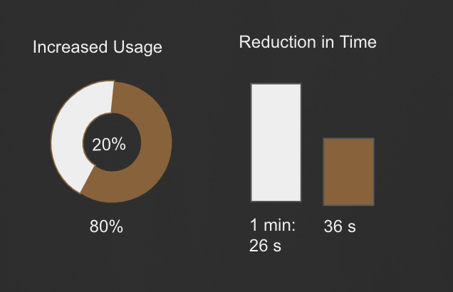
80% of sales team members found the "My Client List" feature in-effective to use, making client management inefficient. Navigating between client dashboards and the list was time-consuming, leading to frustration and low adoption (only 10% of sales reps actively used it). This inefficiency resulted in missed engagement opportunities and hindered sales performance.
Research process
To address the challenges with the Mocca app, I conducted an audit and used an action prioritisation matrix to identify the "My Client List" feature as the most impactful for improving user and business outcomes.
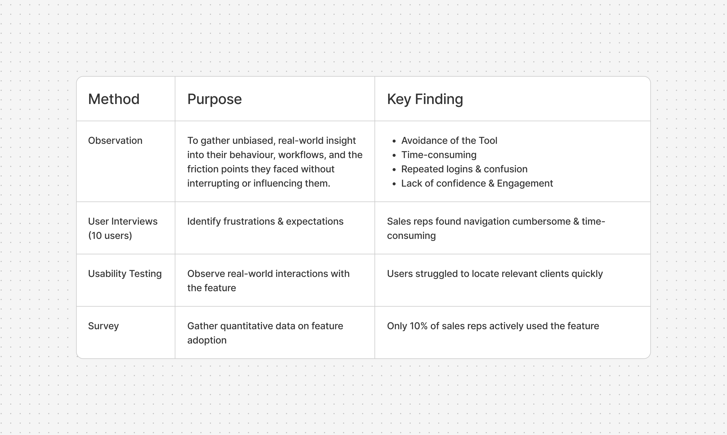
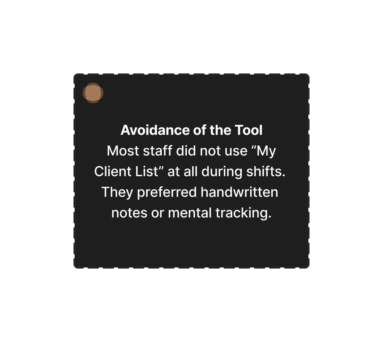
Observing sales staff in action, I noted pain points such as difficulty identifying clients and a lack of perceived value in the feature. Through direct engagement and a collaborative workshop with sales representatives and managers,
I conducted five qualitative interviews with a mix of full-time and part-time sales reps to understand their experiences and attitudes toward the app. This qualitative data, paired with empathy mapping, helped validate user needs and expectations.
I clarified the problem’s context, identified when and where it occurred, and highlighted its potential value.


What exactly is the problem and how is it affecting them?
To dive deeper, we conducted on-premise observation sessions and interviews to pinpoint specific inefficiencies and user needs.
After the cluster of the information in hands I was able to create an empathy map that reflects what the sales team go through during their daily workflow, I also create a journey map to further clarify and understand my users pain point.
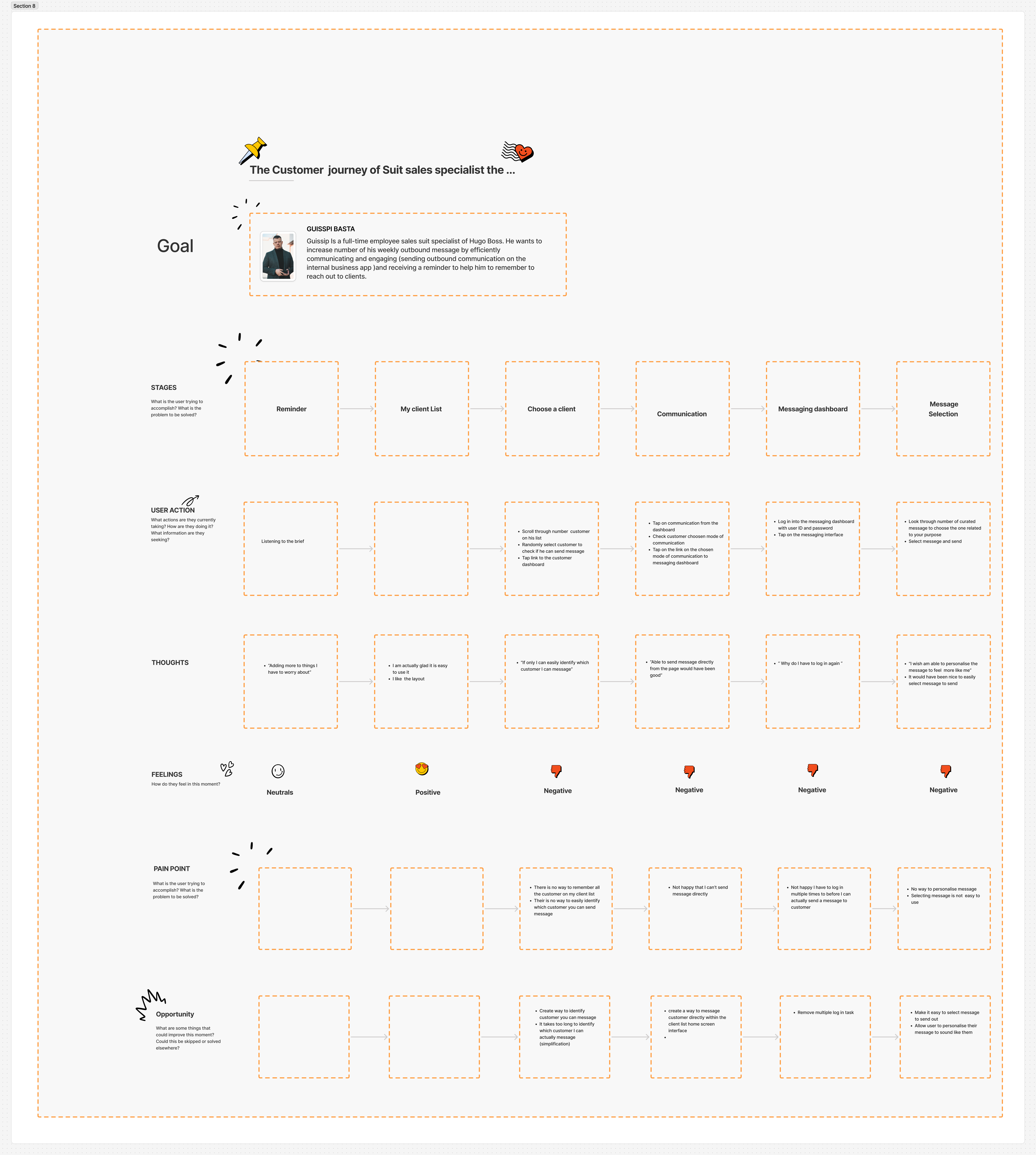


A Day in a sales team Life in Hugo Boss
To truly connect with our user and understand his daily experiences without bias, I created a storyboard. This tool allowed me to visually capture sales team routine, challenges, and emotions, helping me empathise with his frustrations and better address his needs.

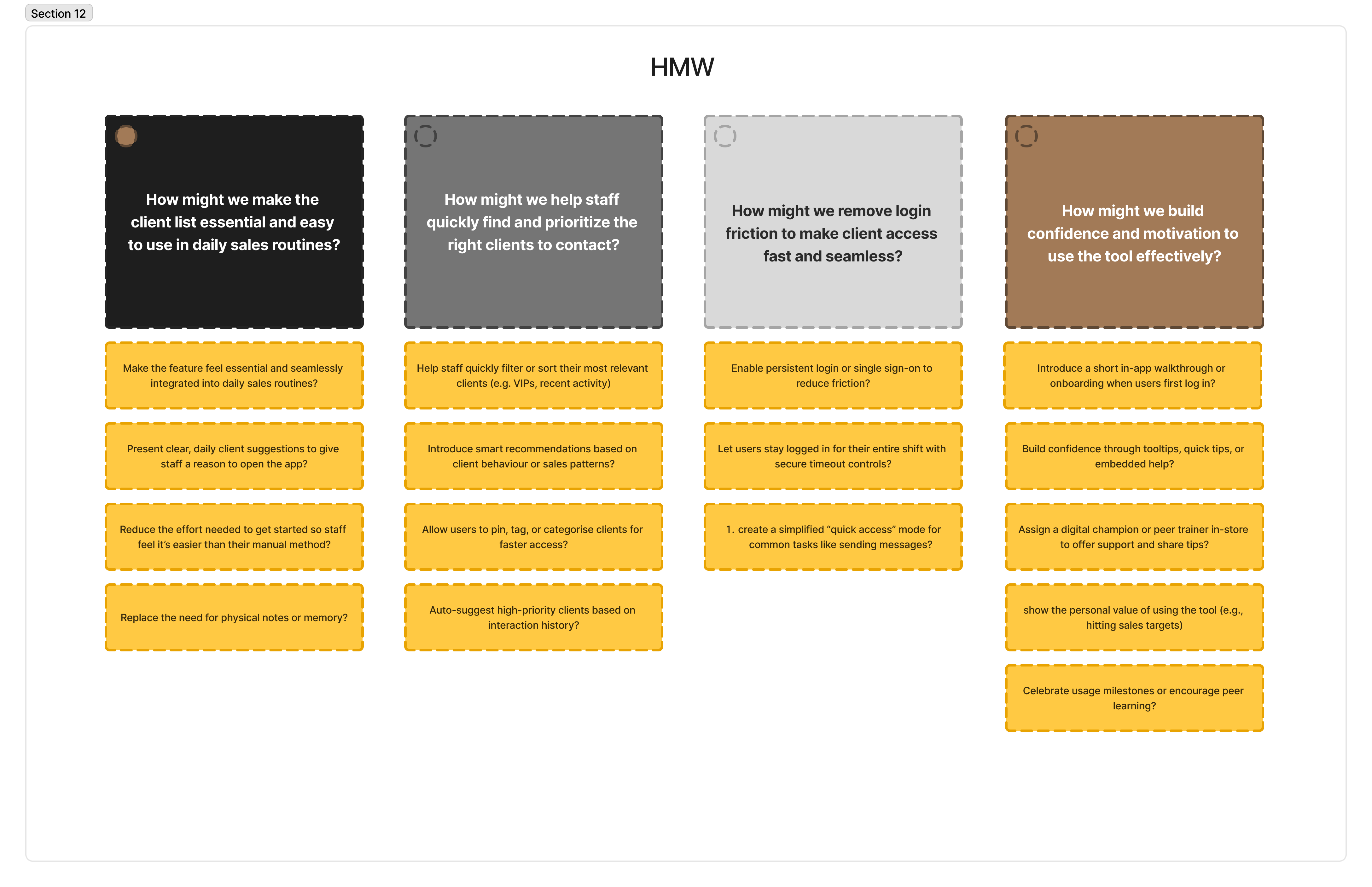
Next, I brainstormed and ideated on what a sales team journey might look like in the future when she starts using my solution. This exercise allowed me to envision how her day-to-day challenges could be transformed, providing clarity and focus. As a result, I was able to craft a clear and actionable problem statement for the sales team.


Core needs of users
A simple, intuitive filtering and search functionality to help users quickly identify relevant clients based on criteria like recent interactions, sales potential, or tags.
They needed a quick way to focus on 2–3 customers daily to meet their KPIs without scrolling through the entire list
Users need to reduce the time spent scrolling through long lists of clients.
They need a quick access to relevant client data without unnecessary steps.
The function should be easy to use, without having to be navigating to multiple page before identifying a client to contact.
Users need the ability to filter clients based on criteria such as: Recent interactions.
Sales potential or priority levels.Custom tags (e.g., VIP, frequent buyer, new customer).
Users need client information to be displayed clearly (e.g., last purchase, notes, last visited) to help them decide who to contact and why.
Users need to align their filtering and search results with daily outreach goals to meet their key performance indicators (KPIs).


Solution-concept design thinking
Our users need an enhanced 'My Client List' feature that simplifies client identification, improves usability and efficiency, incorporates visual recognition elements, showcases the app's financial value, and streamlines communication processes for sales representatives.
Simplifies client identification: Clearly mark clients' consent status and Incorporates visual recognition elements.
Showcases the app's financial value: Showcase sales history on the landing page.
Improved Filtering: Enhance filters for easy client identification.
Simplified Navigation: Streamline access to communication channels without repeated logins.
Usability tests of the interactive redesigned prototype showed
One of the biggest challenges was gathering data without formal permission or access to documentation. I overcame this by aligning with the store's general manager and maintaining a user-centric mindset. As a result of the research, we observed a positive attitude shift among the sales team, giving them a better understanding of the app and its purpose, which led to improved communication and contributed to a 10% increase in the store's Net Promoter Score.
By addressing the challenges faced by the sales team, our solution improved Mocca's utilisation and ultimately enhanced sales performance for Hugo Boss once it is implemented. This case study demonstrates the importance of understanding user needs and tailoring solutions to specific business challenges.


